When we gaze upon a painting, we are often struck by the use of color. Vibrant hues of red, tranquil blues, stark blacks and whites – these colors leap out at us, evoking a myriad of emotions. But what is it about color that speaks so profoundly to us? Can the use of color in painting really influence our emotions?
In this article, we explore the fascinating world of color psychology, a field of study that investigates how color affects human behavior and emotion. We delve into the various ways in which artists use color to create a particular mood or effect in their work, the emotional and psychological effects of different colors, and how colors interact with one another. We also look at key trends in the use of color in contemporary painting and design, drawing on research from sources such as Google Scholar.
Understanding Color Psychology
Color psychology is the study of how colors affect our emotions and behaviors. It’s an essential component of visual arts, graphic design, and advertising, but its influence extends far beyond these realms, shaping our everyday experiences in ways we often don’t even realize.
For artists, understanding color psychology can be a powerful tool. By choosing the right colors, they can evoke specific emotions in viewers, create a certain mood, or even influence people’s perceptions and judgments.
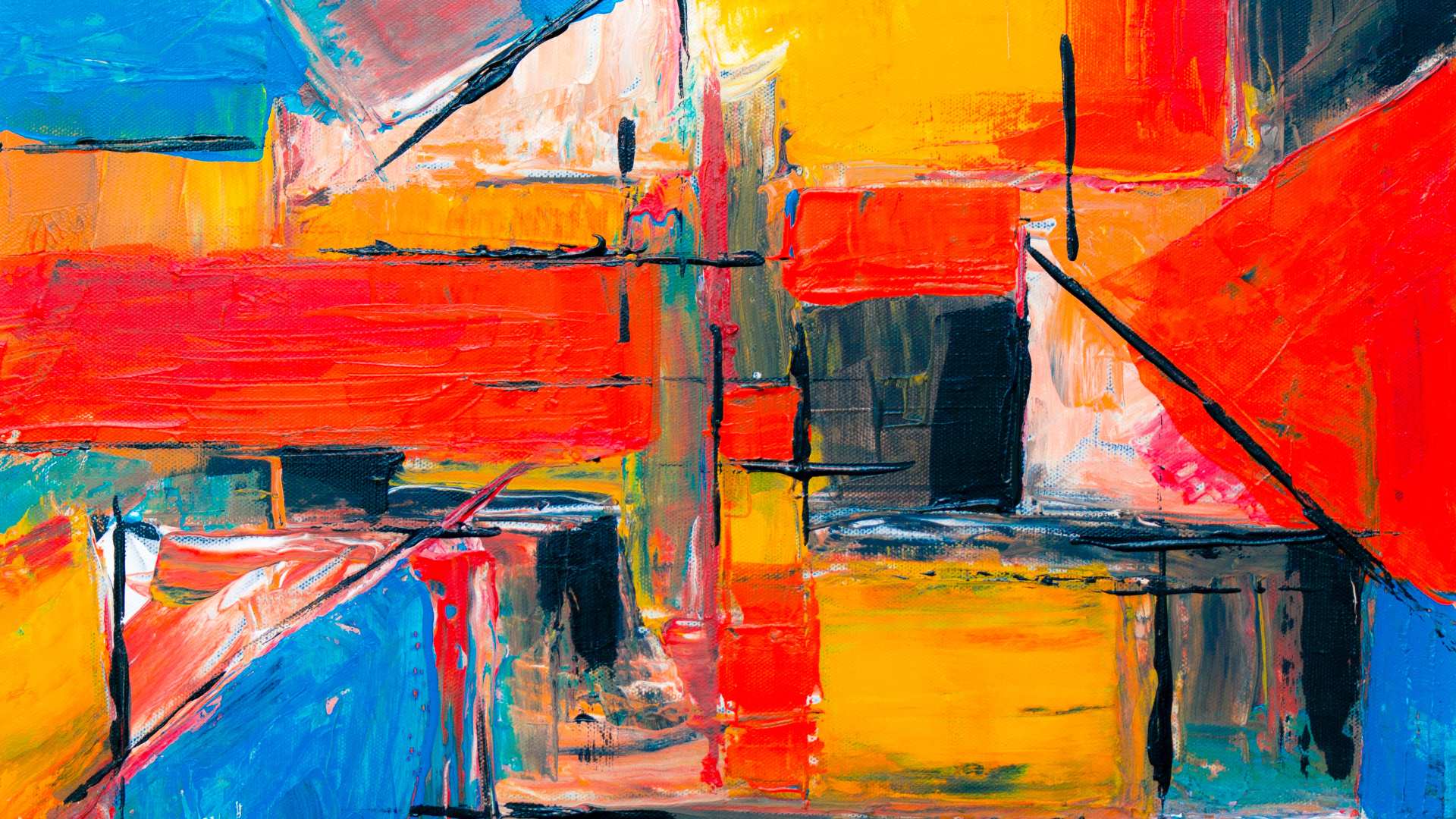
For instance, red, a warm color, often symbolizes passion, energy, and danger. It’s a color that grabs people’s attention and can evoke strong emotions. Blue, on the other hand, is a cool color that suggests calmness, stability, and depth. By understanding these psychological associations, artists can use color to create a certain emotional response or convey a specific message in their work.
The Emotional Impact of Colors
Each color has its unique psychological effects. Red, for example, is commonly associated with urgency and alertness. It can also stir up feelings of passion and excitement. Artists often use red to draw attention to certain elements of a painting, or to evoke a sense of urgency or intensity.
Blue, conversely, is often used to create a sense of calm and serenity. This color is associated with the sky and the sea, evoking feelings of tranquility and peace. In a painting, blue can create a soothing atmosphere, or suggest depth and distance.
Black and white, on the other hand, can evoke a wide range of emotions. Black can signify elegance, power, or mystery, while white can symbolize purity, innocence, and simplicity. Together, black and white can create a stark, dramatic contrast, adding a sense of drama and intensity to a painting.
Green often symbolizes life, growth, and renewal, evoking feelings of freshness and vitality. Yellow, the color of the sun, is associated with joy, energy, and optimism.
The Art of Using Color to Create Emotion
Artists don’t just use individual colors to evoke emotion – they also use color combinations, contrasts, and harmonies to create a certain mood or atmosphere. Complementary colors, which are colors that are opposite each other on the color wheel, can create a vibrant, dynamic effect when used together.
For example, imagine a painting with vivid blues and oranges. These complementary colors create a sense of balance and harmony, while also adding visual interest and energy to the painting.
Artists also use color to create a sense of light and space. Warm colors, such as red and yellow, seem to advance, creating a sense of warmth and closeness. Cool colors, like blue and green, appear to recede, evoking a sense of depth and distance.
Color Trends in Contemporary Painting and Design
| Color | Emotional Influence | Common Usage | Example Artworks |
|---|---|---|---|
| Red | Passion, energy, danger | Love scenes, battle scenes | “The Red Studio” by Henri Matisse |
| Blue | Calmness, sadness, serenity | Seascapes, night scenes | “The Starry Night” by Van Gogh |
| Yellow | Happiness, optimism, caution | Sunlight effects, joyful scenes | “The Yellow Christ” by Gauguin |
| Green | Nature, growth, envy | Landscapes, spring scenes | “The Green Line” by Henri Matisse |
| Purple | Royalty, spirituality, mystery | Subjects of high status, twilight scenes | “The Purple Robe” by Henri Matisse |
| Orange | Creativity, enthusiasm, warning | Sunsets, energetic scenes | “Impression, Sunrise” by Monet |
| Black | Power, elegance, death | Silhouettes, night scenes, mourning | “Black Square” by Kazimir Malevich |
| White | Purity, innocence, emptiness | Snow scenes, highlights, peace | “White on White” by Malevich |
In the world of contemporary painting and design, color continues to play a crucial role. From the bold, vibrant colors of pop art to the muted, minimalistic hues of modern design, artists and designers use color to create a specific aesthetic, evoke certain emotions, and engage viewers in a deeper, more meaningful way.
In conclusion, color is much more than a mere visual element in painting. It’s a powerful tool that artists can use to evoke emotion, create a certain mood, influence perceptions, and engage viewers on a deeper level. Whether it’s the bold red of a sunset, the tranquil blue of a serene sea, or the stark contrast of black and white, color has the power to move us, stir our emotions, and transform our perceptions.
So next time you look at a painting, take a moment to notice the colors. Consider the emotions they evoke, the mood they create, and the message they convey. You might just find yourself seeing the world in a whole new light.


This weekend, I decided to take the plunge! I got Read more